2021


The opportunity
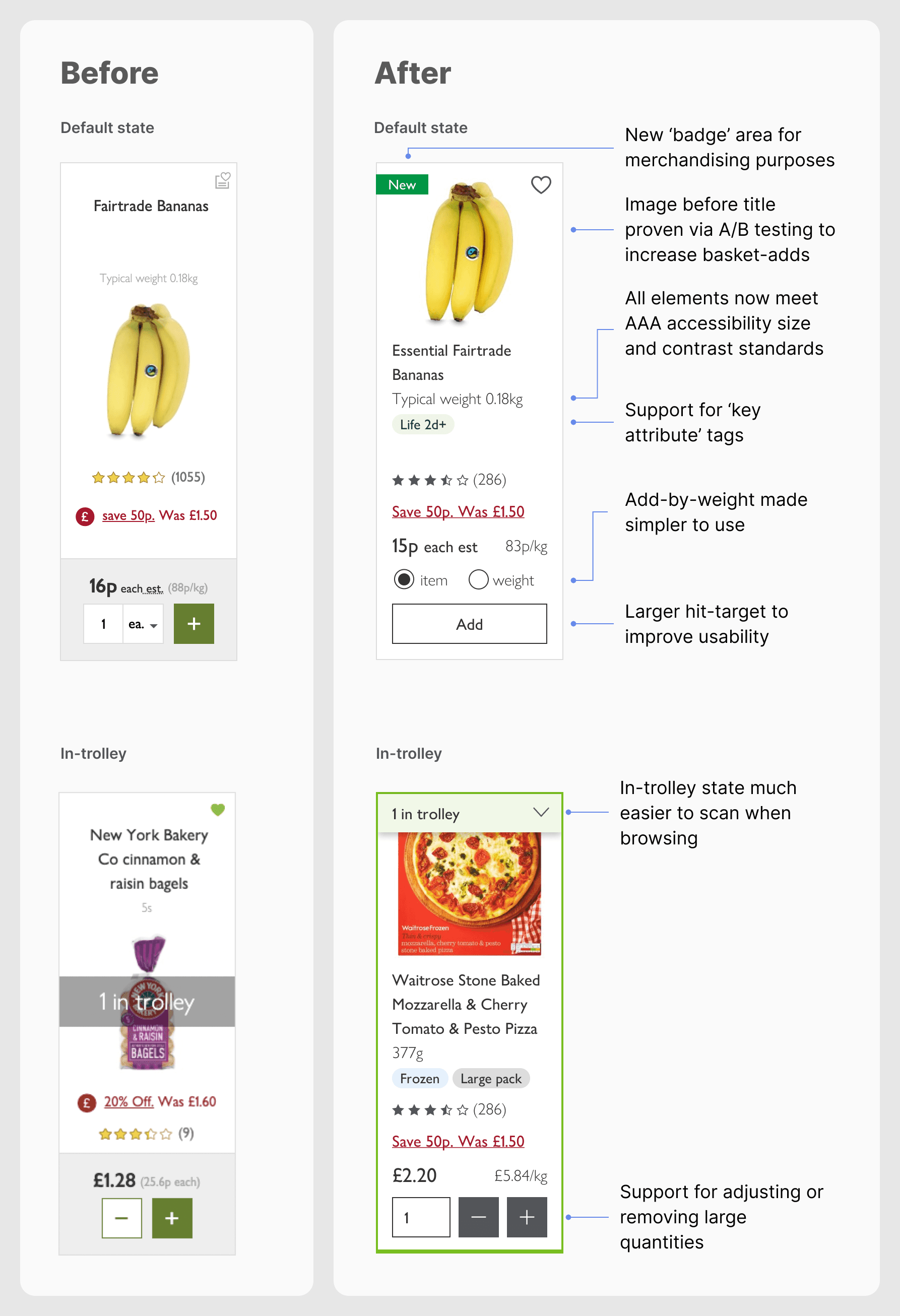
The product listing cards on waitrose.com (known colloquially as 'product pods') are the most frequently-used element of the grocery shopping journey, but usability and accessibility issues had mounted up over time.
I wanted to address the core UX problems but I suspected this wouldn’t be enough by itself to get the work prioritised. So I framed the problem in a way that would appeal to my product manager: a chance to address an obvious accessibility issue while simultaneously creating a scalable UI foundation for new product data, such as 'shelf life' and promotional product badges, something the merchandising team had been asking about for a while.
That secured the buy-in I needed and gave me the chance to address a host of UX opportunities.
My role
As the lead product designer on the 'Shop' sub-team, I:
initiated and shaped the work, aligning it to business and accessibility goals
identified and quantified pain points via verbatim customer feedback
validated changes via usability studies, A/B tests and accessibility audits
collaborated with product, devs, fulfilment SMEs, accessibility consultants and commercial stakeholders
delivered the final, production-ready Figma components covering every case and screen size.
Key problems
The original product pods had accumulated several issues over time:
Poor readability: important product info was small, grey, and non-compliant with WCAG AA standards. This was a frequent source of complaints.
Clunky interaction model: the method of adding and removing items could be fiddly and the evidence showed it was tripping some users up.
Missing context: Key attributes like frozen or chilled were missing – it's easy to tell a frozen pizza from a chilled one in a physical shop, but not so easy online
Visual inconsistency: The styling was tired and didn't align with Waitrose's recent rebrand.
The biggest challenge with the product pods was getting the key info that shoppers needed into a small space without losing coherence. The pods needed to support attributes that may or may not be present, text strings with strict space limits, and a varied range of products from loose fruit to made-to-order birthday cakes. All this info needed to sit nicely in a grid layout, so the flexible and constrained areas needed to be fully thought out.
Exploring opportunities through lightweight experimentation
As well as addressing the most pressing UX issues, I spotted two features that could be surfaced earlier in the journey to improve the shopping experience:
Picker notes: Waitrose allows customers to leave special instructions for grocery pickers (e.g. “green bananas please”). This was a unique point of difference vs the robo-picking used by Ocado, but the option was buried in the trolley. I proposed surfacing it immediately after add-to-trolley to prompt users at the moment of intent. This required the approval of fulfilment stakeholders due to the potential impact on picking times, but they were happy to raise the profile of this customer-friendly proposition.
Substitutions opt-out: opting out of substitutions (where an item is sold out and the picker choses a suitable alternative) required unchecking every item in the trolley, which was an oft-mentioned frustration. A full global opt-out wasn’t yet supported by the business, so I proposed exposing the toggle inline after adding an item — a middle ground that gave users more control without undermining business goals.
Both features were tested with users and rolled out incrementally, with a plan for easy removal or adaptation.
New interaction design and in-card functionality (Axure prototype)
Continuous validation
Given the commercial importance of these changes, we moved carefully, using rapid feedback loops and a data-driven rollout plan.
For each change, I:
ran unmoderated usability testing to check comprehension of changes and discoverability of new elements.
worked closely with the A/B testing team to monitor impact on Average Order Value, basket-add rate and feature engagement
created incremental UI designs to support phased rollouts, ensuring each iteration was suitable to go live while the next iteration was worked on.
This let us ship quick wins, such as fixing the text legibility, while still evaluating riskier or politically sensitive updates in controlled environments.
Accessibility and inclusivity
Addressing accessibility was a core reason this work got greenlit.
In addition to fixing basic WCAG AA issues (contrast, font size), the team worked with an external accessibility testing agency to ensure the new design worked well users of all abilities: distinct focus states, logical tab order and clearer calls-to-action.
When the changes were fully rolled-out, users could now fully add, update, or remove items from the listing page using only the keyboard — something that hadn’t been possible before.
One change I was particularly concerned about was removing the option to add weighted items using imperial units, a change that was necessary to simplify the interaction. The stats showed that this option was very rarely used but I didn't want to exclude older users who thought in pounds rather than grams. To mitigate this, I made sure customer feedback channels were on alert for complaints when this change was rolled out.
Optimised focusing and tab order for keyboard-only interaction
Componentisation and delivery
This piece of work coincided with the design team's adoption of Figma and the launch of Waitrose's design system. I created:
a single product card component that considered every single possible combination of atomic UI elements
Fully responsive states across breakpoints
Clean handoff documentation for developers and other designers
The result was a futureproofed component that could support upcoming features while remaining accessible, legible, and user-friendly.

Figma component variants
Results
+1.9% increase in Average Order Value
+4.4% uplift in sales of weighted produce
Elimination of complaints about small, low-contrast text
Improved accessibility for keyboard users and assistive tech
Why it matters
There was no big-bang launch here. The changes were rolled out in a careful, incremental manner, often invisible by design. But it delivered measurable bottom-line results and a tangible improvement for customers, especially those with visual and motor impairments.
This case study demonstrates the kind of designer I try to be: someone who stands up for users, knows how to get changes prioritised and sees things through with close attention-to-detail.